After more than a decade’s experience and several significant studies about how people read web pages, web designers have developed several tips for good site design. Here are some basic elements you should consider when creating a page.
Navigation Bars
You should keep a few links to your most popular site sections at the top of your pages. Many designers now recommend against a lengthy navigation bar on the right- or left-hand side of interior pages, because research shows that users tend to skip past navigation bars containing more than five or six options. A list of 30, 40 or more options becomes visual wallpaper. If you elect to use a vertical navigation bar, at least give users the option to hide or remove it so that it doesn’t distract from the page’s main content.
Search Boxes
Search boxes are popular because they give users direct access to specific information they want, according to design guru Jakob Nielsen. Be sure to keep your search box constantly visible and away from similar objects. If you put a search box near a log-in box or a newsletter signup box, you may end up with confused users and odd names on your mailing list. Nielsen offers more search tips on his Alertbox site.
Advertising
Clearly label each and every advertisement on your page. If you feel that this calls attention to the fact that you have a lot of ads on a page, ask yourself: Do you think your readers won’t notice the number of ads just because you haven’t labeled them? Besides, the label can be used to link to your advertising policy and your media kit.
Positioning
According to the Poynter Institute’s latest Eyetrack study of web site readership, site visitors’ eyes most often begin in the upper left-hand corner of a page, hover there a while, then begin moving left to right. Readers spend a considerable amount of time looking at the top portion of a page before they begin to read further down. Text is more eye-catching than photos, especially large headlines in the upper right or upper left portion of the page. Navigation links placed at the top of a page draw more attention than left- or right-hand navigation. Further information is available at Poynter’s site.
Unique Look
Your site ought to have its own unique look, but here are a few tips to keep in mind when you’re coming up with a basic template.
Strike a balance between designing for new and returning visitors. Your bread and butter are the people who visit your site frequently, but you’re also going to get more and more first-time viewers as your site grows.
So whenever you get the urge to layer a thick coating of “explainese” on top of a page, stop, walk away from the keyboard, have a drink of water, then come back and try a different solution. Your frequent visitors will be annoyed by the extra words, and first-time visitors probably won’t have the patience.
Remember that you can always put very detailed help text on a second page and link to it so that the interface itself isn’t cluttered. Google’s home page is uncluttered by text. And even Google’s ultra-powerful advanced search interface doesn’t have much additional explanation text — that’s off in the help section, where it belongs.
The reason for this explanatory asceticism is that you want people to use your site, not spend time reading about how to use it. If you offer something so complex it needs instructions each time it’s used, your audience will go elsewhere. The possible exceptions are one-time-only features, like an interactive calculator.
Even then, avoid what author Steve Krug, in his book “Don’t Make Me Think,” (ISBN 0789723107) refers to as “Happy Talk”: overly cheery text that introduces or explains a feature. “It conveys no useful information, and focuses on saying how great we are, instead of delineating what makes us great,” Krug says, asserting that it wastes time for users who want to get directly to the useful parts of a page.
Above all, remember that, as Jakob Nielsen has said, people spend 95% of their online time at sites other than yours. They shouldn’t have to spend any of the remaining 5% of their time puzzling over your site’s snazzy new user interface.
Two Case Studies
Let’s take a look at two well-designed sites and see what we can learn from their front and story pages.
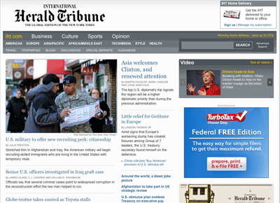
Positive elements:
- The page has an obvious main story and hierarchy for the other stories.
- Some advertisements are labeled, others are not; presumably, some are clearly ads because of their placement and size.
- The top navigation bar has three sizes of type, making the hierarchy of the site content more apparent.
- Colors are few and simple: black, white, gray, a light blue.
Negative design choices:
- Page has become busy since being revamped by the New York Times. Quite text heavy.
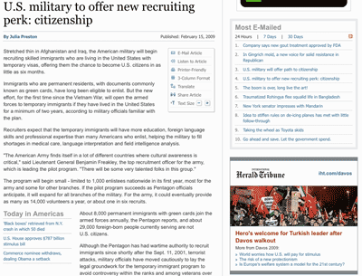
Positive elements:
- There is no left or right navigation bar but the top navigation menu remains consistent.
- Tools to let readers adjust the font size and page layout appear at the top of the story.
- Clicking a byline brings up search results for articles by the same author.
- There is a box with links to related articles.
- The date is clearly presented.
Negative design choices:
- Navigation links – to return to the home page, for example, or proceed to other stories – are not presented once readers reach the end of a story.
- No contact information is available for writers or section editors.
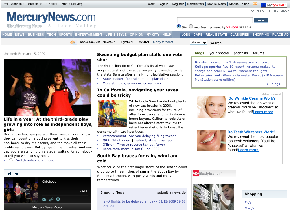
Positive elements:
- A large space is given to the day’s top story and supporting graphic elements.
- The top navigations menu is clearly designed
- Personalization options are presented clearly; after logging in, you can place classifieds, subscribe to email newsletter, and update your account from a link at the top of the page
- Ads are clearly marked, either with words or boxes.
Negative design choices:
- Links are not clearly indicated by color, just rollover underlining.
- A weather “Search” link is too close to the site search, possibly confusing visitors.
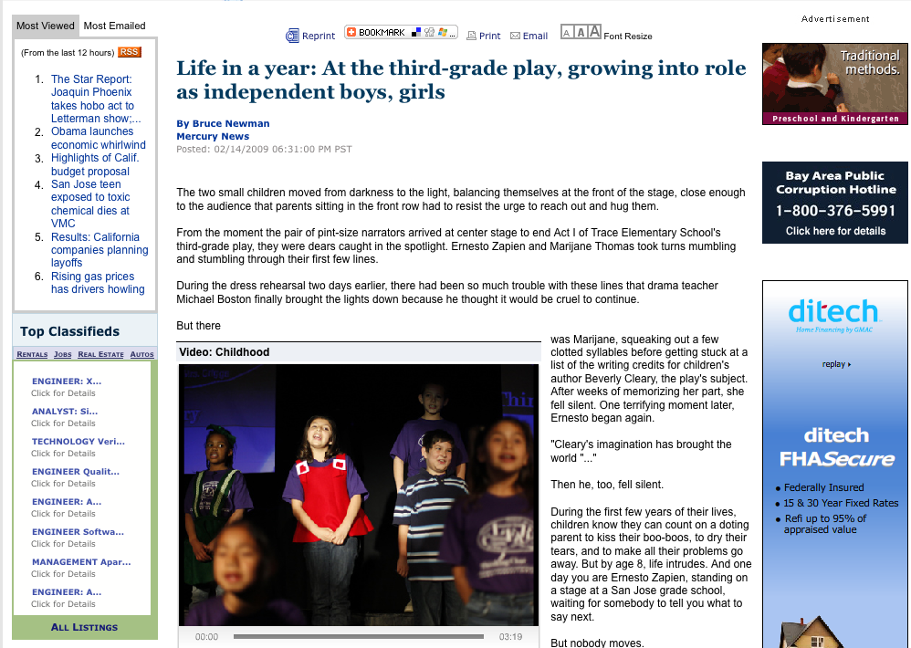
Positive elements:
- Links that let users print the story or e-mail it to friends are repeated at top and bottom of page.
- Video player is prominently displayed in the center of the page
- Advertising is clearly marked
Negative design choices:
- No “Back to Home” link as part of a trail of “breadcrumb” links at the top of the story, letting users retrace their steps.
- Readers have to navigate a virtual obstacle course between video player, ads and related items box